" height="16.105846188517717px" id="d8ocSgdvf" transform="translate(20.148 3.872)" width="3.7883077087402377px"/><path d="M 3.146 2.171 L 0 2.171 L 0 0 L 3.146 0 Z M 3.079 14.156 L 0.066 14.156 L 0.066 3.655 L 3.079 3.655 Z" fill="rgb(255, 255, 255)" height="14.156313890536383px" id="Q86BCRZI9" transform="translate(14.648 5.534)" width="3.1458461538461666px"/><path d="M 11.897 13.292 L 8.706 13.292 L 8.706 8.108 L 3.19 8.108 L 3.19 13.292 L 0 13.292 L 0 0 L 3.19 0 L 3.19 5.25 L 8.706 5.25 L 8.706 0 L 11.897 0 Z" fill="rgb(255, 255, 255)" height="13.292307692307693px" id="gBNeo28SG" transform="translate(0.543 6.398)" width="11.896608000000015px"/></svg>)


MY ROLE
Lead Product Designer
DELIVERABLES
Logo & Brand Identity
Website (Desktop & Mobile)
Case Study Templates
Client-Facing Documents
Marketing & Social Assets
Design System
TEAM
Chop Dawg Leadership
Marketing
Web Developers
QA
Supporting Designer (illustration & production)
YEAR
2024 - 2025
What Was the Problem?
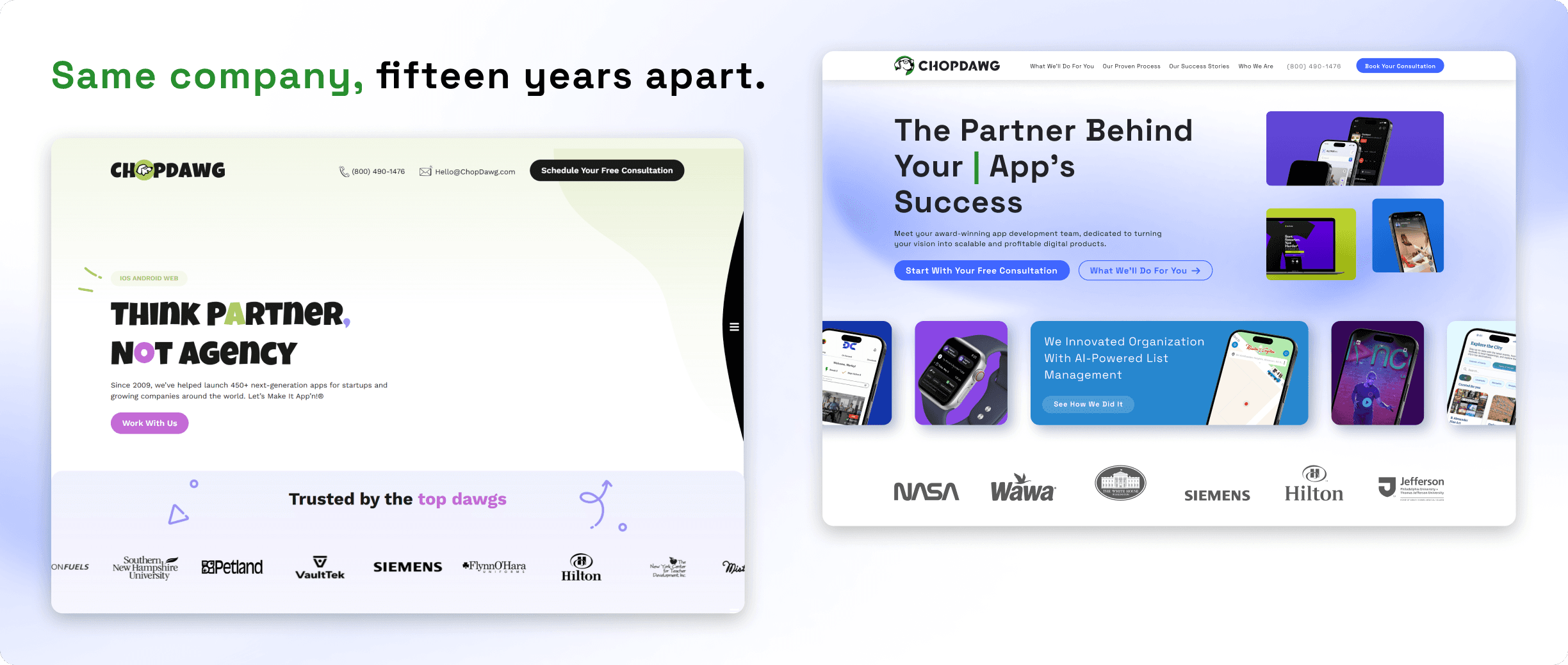
Chop Dawg had been building digital products since 2009, with a client list that had quietly grown to include Siemens, Hilton, NASA, and Six Flags. The brand hadn't grown with it. The identity still spoke in the voice of an early-stage startup — bright greens, cartoon illustrations, playful slogans — and every touchpoint carried it:
The mark itself had aged out. The logo was built for the company Chop Dawg was in 2009 — a mascot-first identity that read as a scrappy shop, not as a partner an enterprise hands a multi-year build to.
The website undersold the work. Chop Dawg was already building for Siemens, Hilton, and NASA, but the site read like a small app shop — a mismatch that surfaced every time a large organization ran the company through procurement or legal review.
The sales material contradicted the pitch. Proposals, NDAs, and letters of intent went out to enterprise prospects wrapped in visuals designed for first-time founders.
Nothing was consistent. Documents, email signatures, and social profiles had drifted apart over the years, each carrying a slightly different version of the brand.
Publishing was blocked on design. New client work couldn't be showcased without a designer building the page from scratch, so the portfolio lagged behind the actual work.
The Challenge
For an agency, the brand is part of the product. A prospect deciding whether to hand over a six-figure build reads the proposal and the website as evidence of how the work itself will be done — so the redesign had to project seriousness without losing the warmth that had won Chop Dawg its earlier clients.
Enterprise buyers don't just look at work; they look for signals that a vendor is safe to sign with. The rebrand had to produce those signals without turning Chop Dawg into another anonymous consultancy.
The scope was also unusual for a website project. The identity touched everything the company sent out into the world, which meant the system had to hold up in HTML, in PDF, in an email signature, and on a social banner, and had to be usable by people who don't open Figma. Whatever I built had to keep working after I stopped being the one building it.
Redrawing the Mark
Everything else in the rebrand depended on this. I redesigned the logo from the symbol out: a simplified, geometric take on the dog mark that keeps the character the company was known for while dropping the illustrative detail that never survived being scaled down or printed in one color. I set the direction for the mark and worked through it alongside a designer from my team.
The tagline stayed. Fifteen years of clients knew it, and dropping it would have thrown away recognition the company had actually earned — the job was to make it sit inside a system that reads as serious, not to erase the company's history.
Rather than delivering a single file, I built the mark as a system — horizontal and stacked lockups, symbol-only versions for avatars and favicons, and full guidelines for spacing, minimum sizes, and color applications across light and dark backgrounds. That's what made it possible for the logo to sit in an 80px website header, on a proposal cover, in an email signature, and on a LinkedIn avatar without being redrawn each time.
The wordmark was drawn rather than set — each letterform constructed on a grid so the logo holds its proportions from a favicon to a proposal cover.

Proof Above the Fold
The homepage was rebuilt around evidence. The hero states the positioning in one line, and directly beneath it sits the client logo strip — NASA, Siemens, Hilton, Wawa — followed by a scrolling band of real project work, testimonials, the process, and press coverage. A prospect scrolling the page is never more than one screen away from a reason to believe.
The visual language moved from the previous saturated palette to a restrained blue and violet gradient system, with generous space and typographic hierarchy doing the work that decoration used to do. The result reads as a company with a track record rather than one asking for a chance.

Turning the Sales Conversation Into Pages
Chop Dawg's advantage was never a single service — it was the way they run a project from scoping to post-launch support. The old site never explained that, so it fell to the sales call every time.
I structured the site around that conversation: a services hub with dedicated pages for Strategic Planning, Design, Development, and Support, and a full page walking prospects through the proven process phase by phase. Every page ends in the same consultation CTA, and the booking flow got its own designed path through to a thank-you page, so no prospect ever reaches a dead end.
I worked with a designer from my team throughout, who produced the illustrations across the site and much of the production work on top of the system.

A Portfolio the Team Could Keep Updating
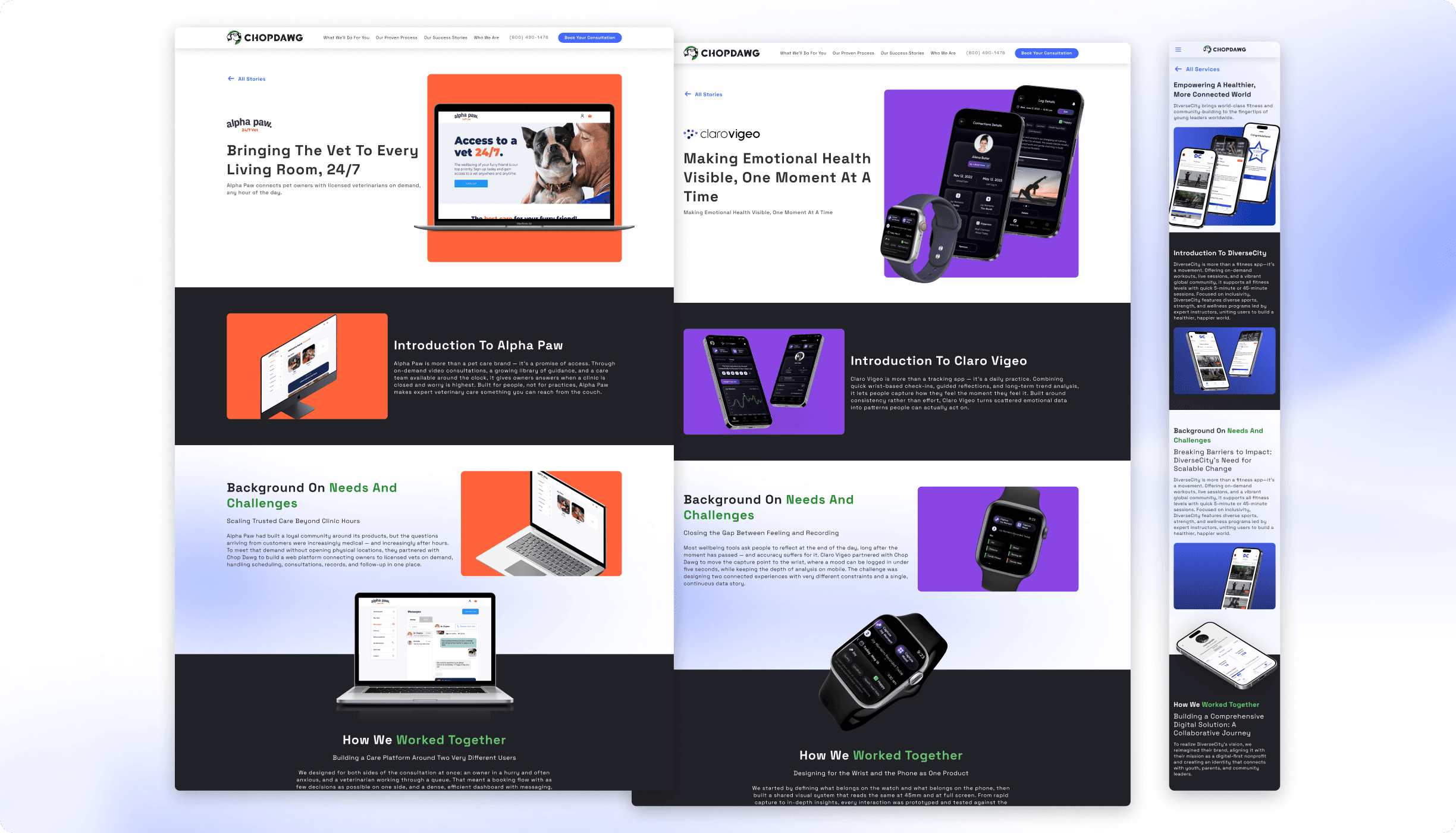
The success stories were the part of the site most likely to go stale, so I designed them as a system instead of as pages. I built three case study templates covering the shapes Chop Dawg's work actually takes — mobile app, desktop app, and watch-plus-mobile — each with a consistent structure: hero, client context, challenge, solution, feature breakdowns, and results.
Every template exists in desktop and mobile, with a repository of stories feeding the index page. Adding a new client story became a matter of filling a structure rather than commissioning a design, which meant the site could keep pace with the work.
An Identity That Left the Website
The website was the visible half. The other half was every artifact the company sends out before and after a prospect ever visits it — and the new mark had to survive all of them.
I rebuilt the entire client-facing document system in the new identity — NDAs, letters of intent, non-functional prototype proposals, and full development proposals — each with designed covers, section dividers, letter pages, ratings and client pages, and award badges. Alongside that came the email signatures used across the company and the cover and profile assets for Facebook, Twitter, and both LinkedIn accounts. By the end, every artifact a prospect could receive spoke with the same voice.
This is where the rebrand met its real test. In an enterprise deal, the NDA and the proposal are read by people who never visit the website — legal teams, procurement, executives signing off on budget. Those documents had to look like they came from a company of that size, because for many stakeholders they were the only artifact of Chop Dawg they would ever see.

Building It to Be Reused
Everything above ran on one component system. I built the site's library — navigation, hero patterns, service and process blocks, testimonial and media rows, CTA sections, footers, buttons, and cards — with the mobile behavior defined at the component level rather than redrawn page by page. That's what made it possible to deliver every page of the site in both desktop and mobile, plus three case study templates in both, within the project's timeline.
The document system followed the same logic, with its own set of shared covers, dividers, and footers, so a new proposal type could be assembled from existing parts instead of designed from zero.

What Happened Next
After the rebrand rolled out, Chop Dawg started closing noticeably more projects, and started closing them with larger companies than before. I can't claim the identity caused that on its own — sales outcomes never have a single input, and I had no way to isolate the variable.
What I can say is what changed on our side: the company stopped apologizing for its own materials in enterprise conversations. The proposal that arrived in a prospect's inbox now matched the caliber of the work described inside it, and the site gave the sales team something to point at instead of something to explain around. That gap closing is what the project was for.

Conclusion
I led the rebrand of a fifteen-year-old software agency whose identity had fallen behind its own client list: a new logo and brand system, and every surface it touches rebuilt around it — website, proposals, contracts, email, social. The work was less about a new look than about closing the distance between how Chop Dawg worked and how Chop Dawg appeared to work. After the rollout, enterprise organizations that had never signed with the company started doing so — and while no rebrand closes a deal on its own, it stopped being the reason a deal stalled.